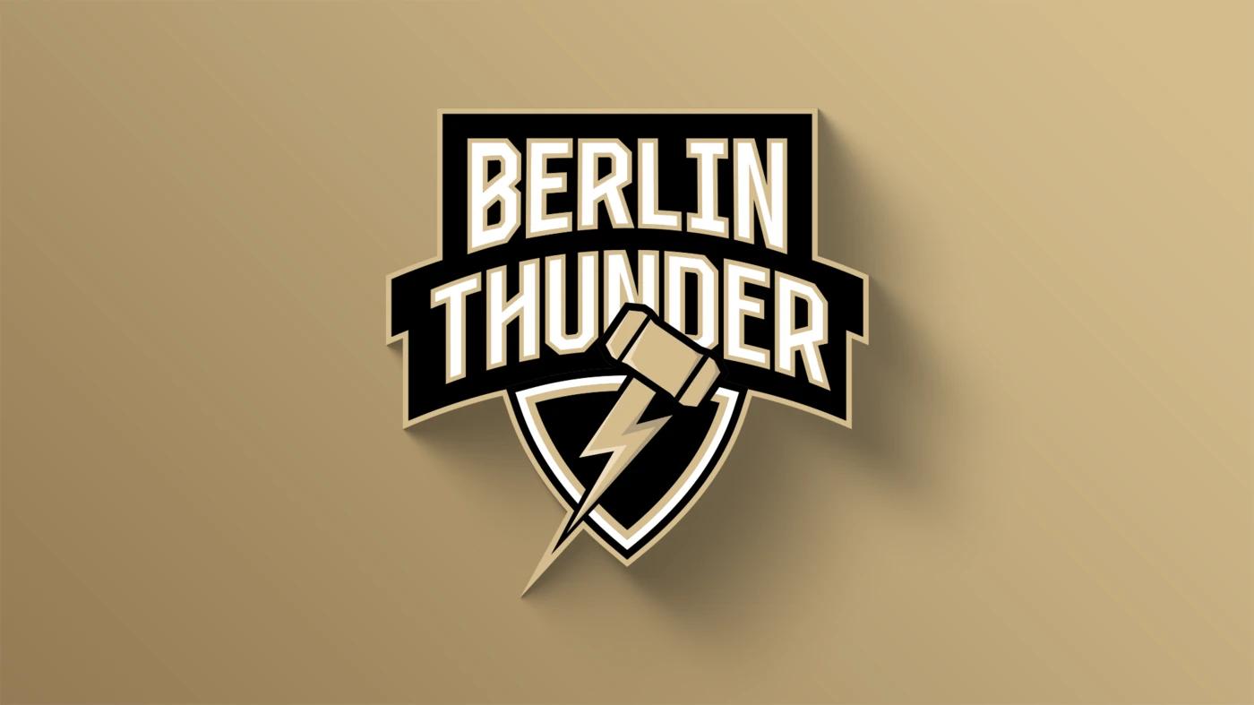
Berlin Thunder presents new logo and slogan
ELF Communications

Berlin Thunder is stepping into the 2025 season with a new bold look - "strong, modern, and deeply connected to the capital". The German franchise just announced their completely redesigned logo.
"This comprehensive rebranding introduces an iconic new logo that unites Thor’s hammer and lightning - a tribute to Norse mythology and our own history. These powerful symbols represent the strength, determination, and unmatched fighting spirit that define the team in the heart of Berlin. Berlin Thunder embodies the dynamic energy of a city that never sleeps and is always full of life", the franchise explains.
Further: "The new color scheme - black, white, and gold - reflects the strength and elegance that Thunder Nation exudes, embracing the Berlin community. Black stands for power and determination, white symbolizes potential and clarity for each new season, and gold adds a distinctive touch of excellence and pride. These colors fuse Berlin Thunder’s traditions with its vision for the future, resonating throughout the fan community and beyond."
New slogan "Feel the Thunder, Feel Berlin!"
With the new slogan, "Feel the Thunder, Feel Berlin!" the franchise celebrates the deep connection between Berlin Thunder and the capital. "It’s not only a call to experience football up close but a promise to Berliners: Thunder is part of the city, embodying the values of Berlin - passion, unity, and the unstoppable strength that defines this place."
Berlin Thunder invites everyone to be part of this movement. "The team is more than just sport; it’s a family that celebrates victories together and grows stronger through every challenge."
